Friday, March 28, 2014

"Cuddly Hue-Party In Space"

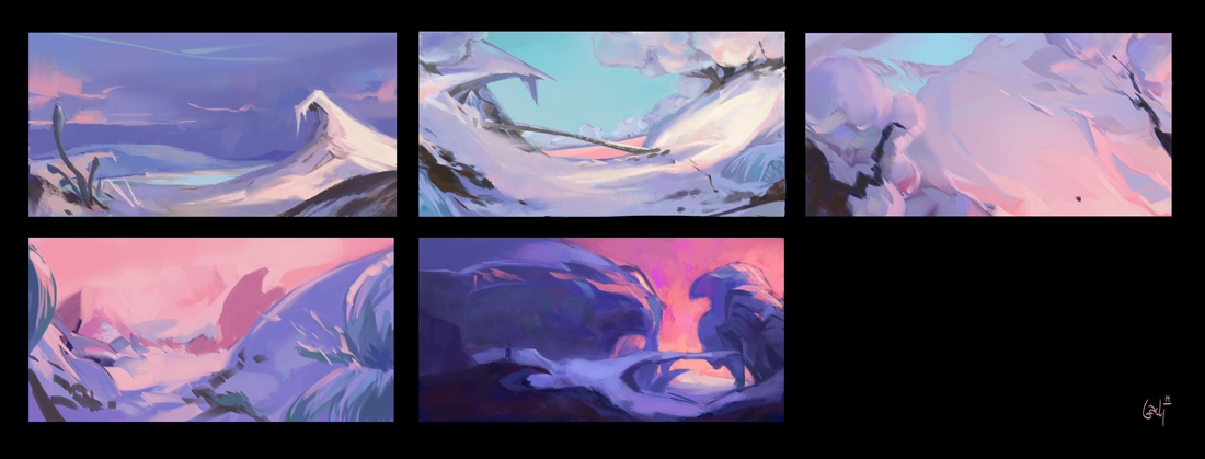
This week I've had the pleasure of having Joaquim Royo as a teacher once again - and it's been fantastic! I've learnt a ton of things and been presented with fantastic artwork and analysis of these. I decided to go for a space-snowlandscape and this is the result - the final piece and the colorkey I did before.


/B

Friday, March 21, 2014

Moxie 2107 - Selfstudy

"Moxie 2107"

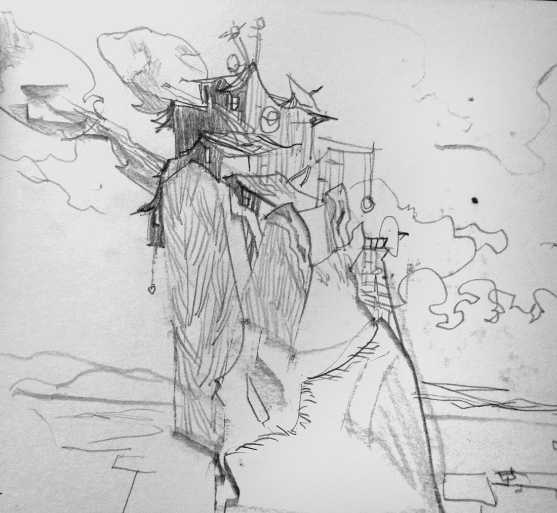
This is the selfstudy-project I've been working on the last couple of months at school. The story I came up with is as follows:

"A fictional story set in the future, year 2107, where climate changes, flood and polution have changed the world - mostly 3rd world countries like Malaysia, Philippines and Bangladesh. We're the observer of this changed world through the city of Moxie – a sinking city, that keeps rebuilding itself upwards to survive. It's the story of a perserverant and adaptive society that despite the challenges, have an incredible determination to survive."


/B

Wednesday, March 19, 2014

Left Hand Drawing pt. 2


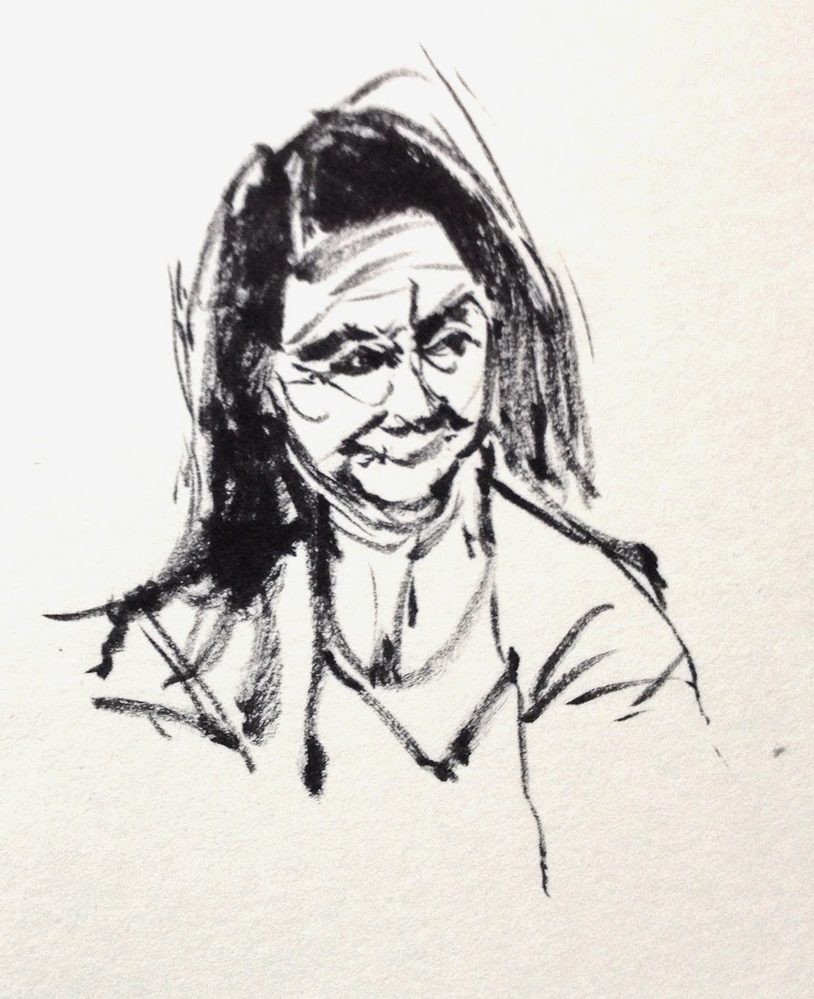
I'm still stubbornly practising my left hand sketches, and I'm slowly gaining more control over my movements. It is indeed slower, but the results so far is encouraging to me. I don't get to do these left-hand sketches as often as I would like to - but still it's a steady proces. I'm particularly happy about the last two "copy-drawings


My sister Emilie Bach

Copy sketch of Santiago Montiel


/B


Paris sketches

Sketches from a 4 day trip in Paris a month ago. Got the chance to see Louvré, Musée D'Orsay + Art Ludique's Pixar-exhibition with clay-sculptes and original pieces of art. Great stuff!


/B


Saturday, March 15, 2014

Nerdy Observations - "Bambi"

For a long time I've admired the background-paintings of "Bambi" and found them to have incredible draftmanship and delicacy. I've looked at them many times, but I haven't sat down and "really" looked at all of them, taken my time and figured out why they're working so well. First of all I want to mention that all of these background have incredible and solid layouts and valuestudies as seen here - so in my analysis I don't go too much into that aspect. The biggest realization for me personally during this analysis, was the way they make transitions: From dark on light, to light on dark, or from crisp->soft. In addition to this, paying attention to thin/fragile versus massive/thick. On a general note, I think what really works well in these backgrounds is just how controlled the edges is - soft, sharp, transitions - they all blend beautifully together.


I hope you enjoyed it!

/B

Thursday, March 13, 2014

Nerdy Observations - "The Lion King"

Occasionally I like doing a bit of analysis on movies or artists I like. Recently I was re-watching "The Lion King" for the first time since I was a child - and this time I couldn't help but notice all the color work in the movie. This lead me to a little cozy session grabbing screenshots from scenes I liked, and compiling it into this little "Nerdy Observations"-post.


I hope you like it. Let me know if this is something you'd find interesting to see more of!

/B

Monday, March 10, 2014

Pastel colors

Inspired particularly by the works of Bill Cone - I felt it was time to spend more time using traditional mediums - so I went ahead and bought a massive 72-color pastel-set w. fixative-spray, a wooden plate w- clips, lots of various of pastel-sketch paper-sketchbooks. So after 4-5 various tries with this challenging medium, this is the first one I feel was somewhat succesful :)


/B

Saturday, March 1, 2014

Smudgy + Speedpaint

Various environments using mostly the smudge-tool


"The Black Plague" - 30 min.

Tried some new technique painting the picture 70% with the smudge tool's fingerpaint-setting. See Marco Bucci's tutorials for the technique
Good fun!

/B